In December of 2013, I closed my LinkedIn account. As I retold in an emotional post Facebook post, I had discovered that I had been sending those annoying “Dan Schlosser has invited you to join LinkedIn” emails to my friends. Confused, I spent several hours digging around in LinkedIn settings and menus to figure out why.
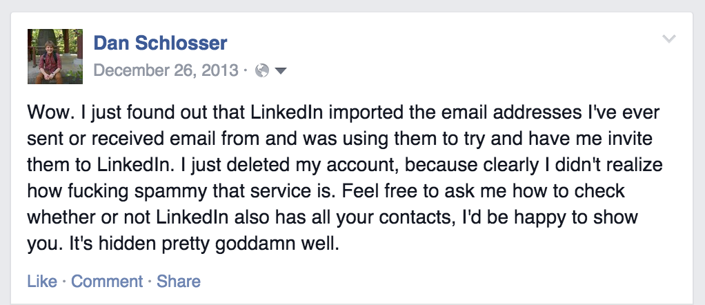
It turned out that when I made my account years earlier, LinkedIn had tricked me into importing my address book. If they had used the contents of my address book just to suggest contacts on LinkedIn, I might not have minded, but they went further.
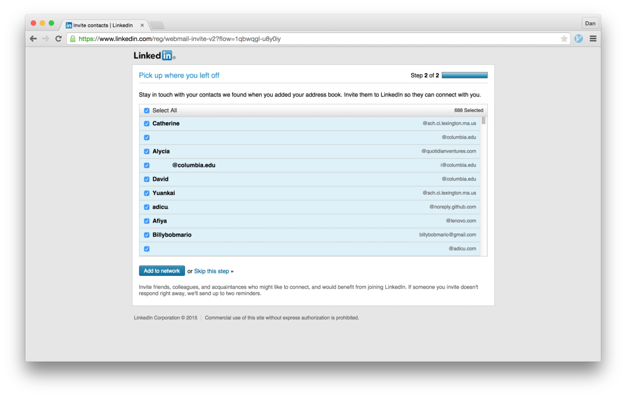
On the “People You May Know” page, LinkedIn had inserted a few buttons to invite email addresses from my address book to LinkedIn, and made those buttons look a lot like people already on LinkedIn that I could connect to.
The difference between these two kinds of buttons was negligible, and as a result I had been sending spammy emails when I thought I had been sending connection requests. This feature has since been refactored (why I felt comfortable joining the service again recently) and these two buttons do not show up next to each other anymore.
Instead, they make it one-click to invite every one of your contacts unknown to LinkedIn to the service.
It also shows up in the contacts manager, where it only takes one click to both connect with every person in your contacts who is on LinkedIn, and to send a “Join LinkedIn” email to every person in your contacts who isn’t.
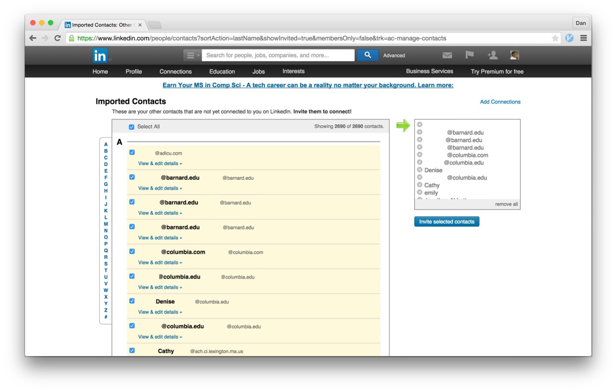
This system, setup to trick me into inviting people in my contacts to LinkedIn, is called a dark pattern. In UX design, a dark pattern is design that works against users. It might trick them into doing the wrong thing, or just confuse them to the point where they can’t figure out how to do something that the designers don’t want them to do. This could be making it hard to delete a user account, or in LinkedIn’s case, making it really hard to use the service without importing your entire address book.
Worst Practices: What’s Really Behind All That LinkedIn Spam.
In order to bring LinkedIn’s spammy practices to light, I’ve walked through all the steps needed in order to sign up for and use LinkedIn without importing your address book. Check it out, it’s near impossible.
Along the way, I’ll take a look at how LinkedIn uses design to trick its users.
Account Creation.
For most people, this is where they get you. The big offense throughout this whole process is conflating OAuth with address book importing. Take a look…
The Landing Page.
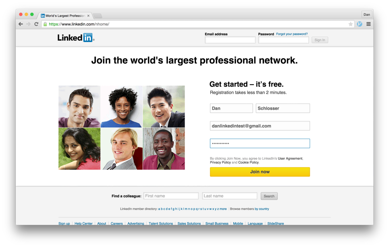
This page is pretty simple. There aren’t any dark patterns at play here, unless you count the User Agreement, Privacy Policy, and Cookie Policy that joining the service entails. This page is clean.
Basic Profile Info.
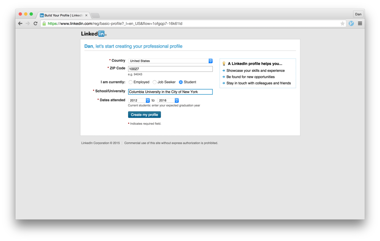
This page is also clean. LinkedIn uses this info to connect you with other people that work at your company, or went to your school, and that’s to be expected. They give a nice explainer in the box on the right side.
Simple and straightforward, right? Yeah, right.
LinkedIn Data: The First Dark Pattern
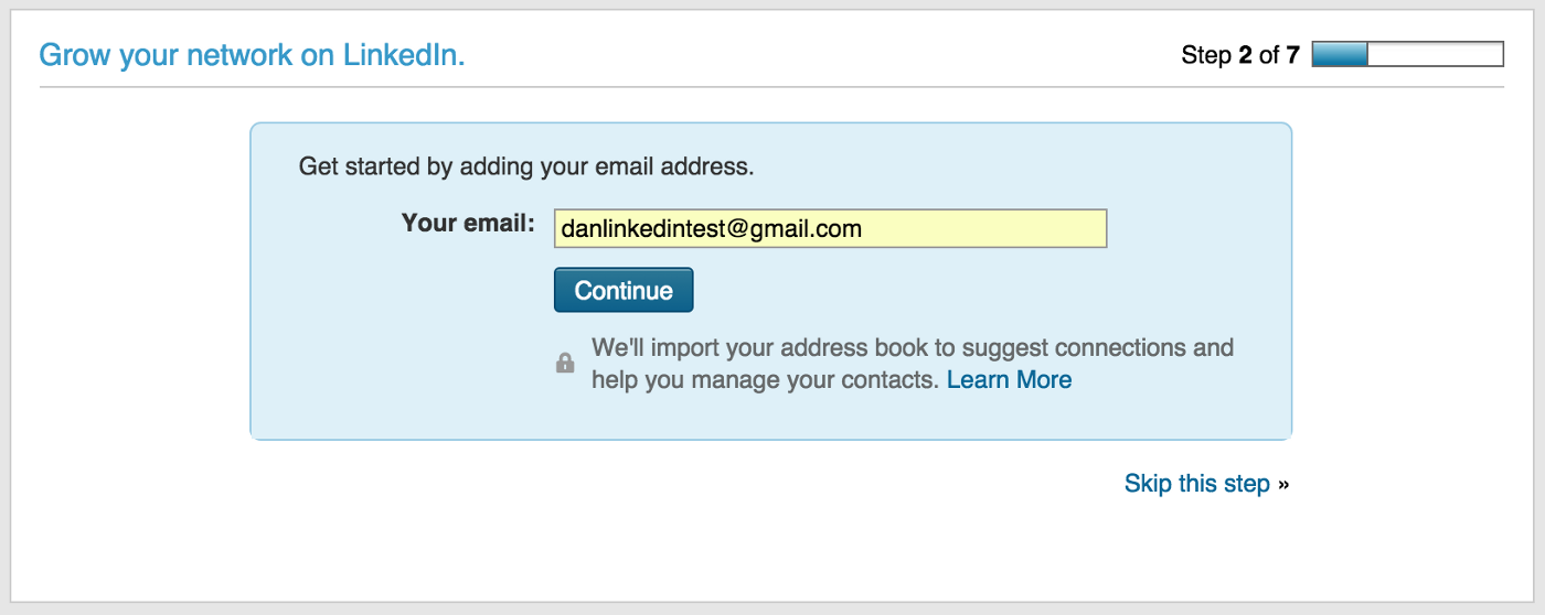
Here’s where things get messy. After filling out basic profile information, LinkedIn asks you to “Get started by adding your email address.”
There is a note explaining what this button does, but because it is put in light gray text next to a bold blue “Continue” button, they get most people to blindly click ahead.
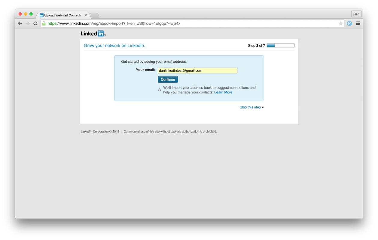
This is definitely a dark pattern. In fact, it’s really a lie. This page is not for “adding your email address,” it’s for linking address books.
OAuth Dialogue.
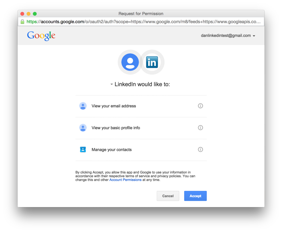
After clicking the blue continue button on the previous page, the Google OAuth popup appears. Note that one of the permissions being granted is “Manage your contacts.”
Google hasn’t done an amazing job highlighting this fact, but it’s pretty good. If someone were to click “Accept” at this stage, the user’s entire address book would be imported into LinkedIn.
This is where I went wrong the first time. Here, LinkedIn is taking advantage of the fact that Google uses the same OAuth popup for address book import as they do for the “Log in with Google+” dialogue. LinkedIn knows that most users just click through these windows without reading the permissions.

The Failure Screen.
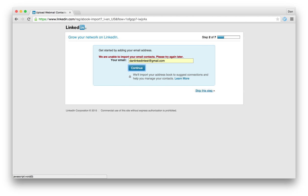
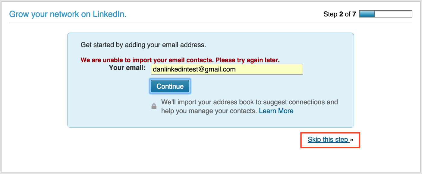
If the OAuth flow is cancelled, an error appears. It reads “We are unable to import your email contacts. Please try again later.” The continue button brings the OAuth window open again; you need to find the tiny “Skip this step” link at the bottom right to proceed.
Moreover, the link is placed outside of the blue box which ostensibly contains all relevant info or controls. This page is excellently designed, but it’s designed to trick users.
Are You Sure?
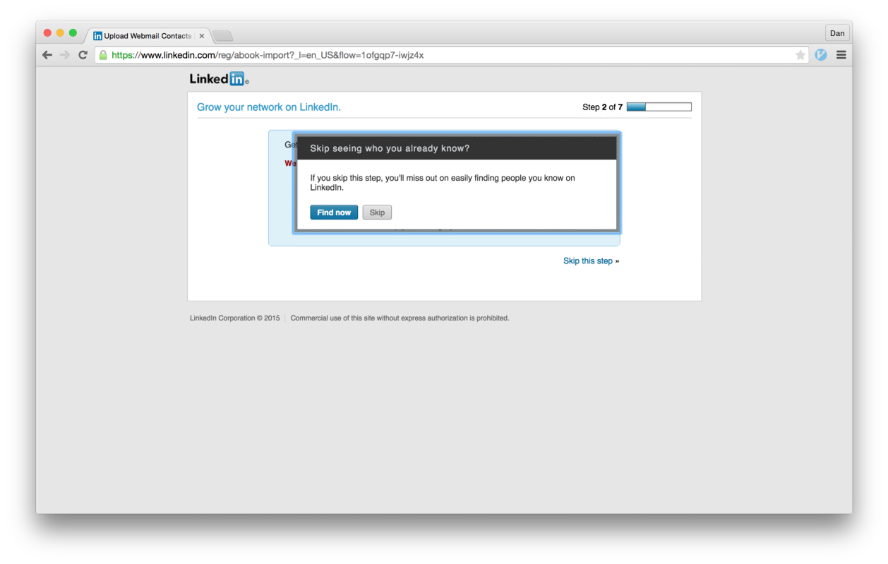
Just in case you found the hidden link by accident, LinkedIn asks you to confirm that you do indeed want to skip the address book import. Notice that “address book” or “contacts” show up nowhere in this popup window. Instead, you’re prompted to “Find now.”
Wouldn’t it be nice if LinkedIn gave this kind of warning dialogue when you click the button that gives them your entire address book?

Confirm Your Google Account.
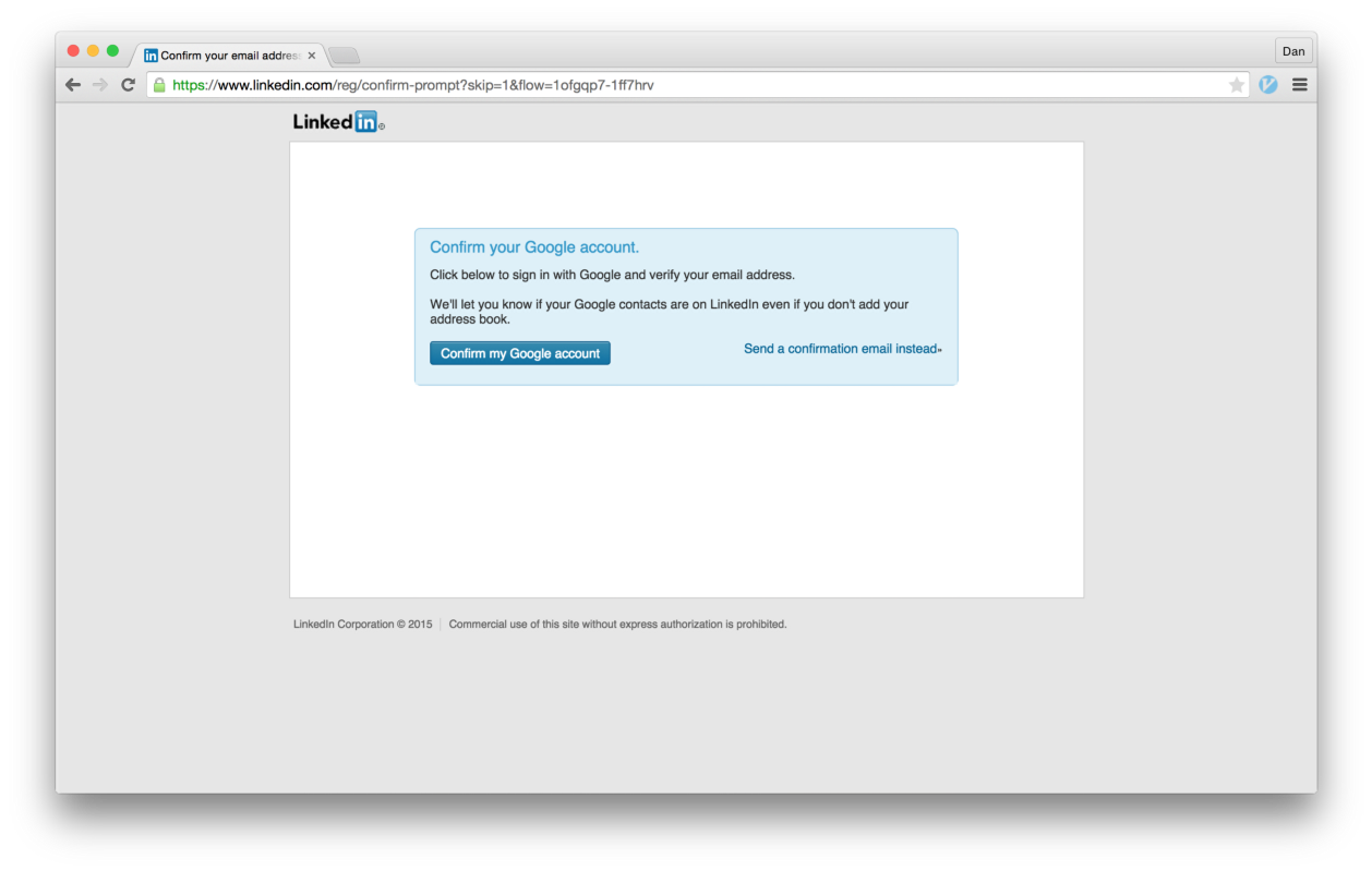
This next page is pretty insulting. The text asks the user to “confirm” their Google account, and “verify” their email address, but what LinkedIn is not saying is that clicking “Confirm my Google account” will sync the user’s address book with LinkedIn.
The user has already indicated on the previous page that they do not want to sync their address book with LinkedIn, but they try again anyways.

We Could Not Confirm Your Email Address.
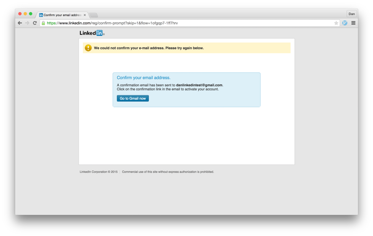
If we cancel out of the OAuth dialogue on the confirmation page, a warning appears indicating that a confirmation email has been sent instead. For once, the blue button on the page doesn’t import all your contacts, and instead links to Gmail.
Confirmation Email.
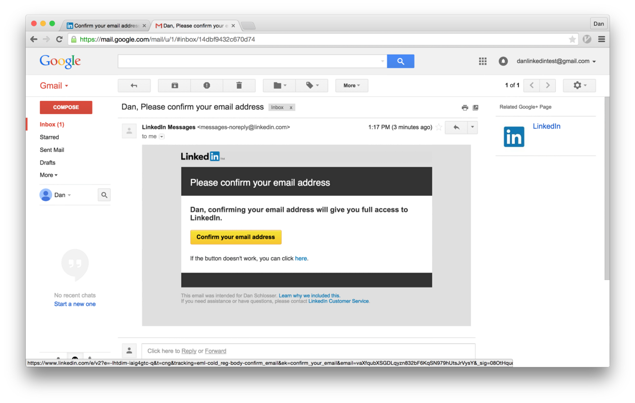
This is the email that LinkedIn sends to confirm your email address. If you click the yellow button, it links to the next page shown.
Add Your Email Address… Again?
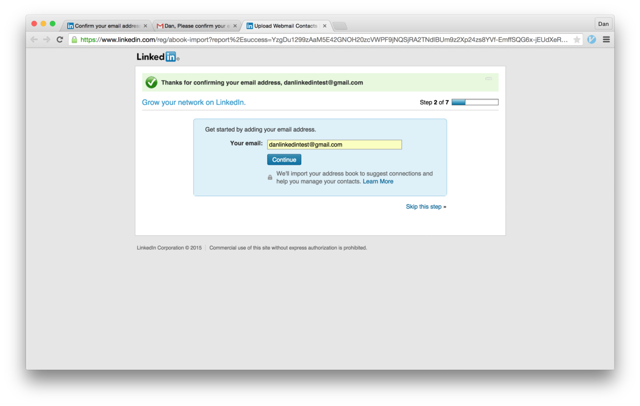
Following the link in the email shows a success message which reads “Thanks for confirming your email address…” right next to a box asking you to “Get started by adding your email address.”
Recognize this screen? It’s the same one as before. Once you confirm your email address, they try a third time to get you to “add” it. After the first two times that the user explicitly skipped adding their address book, it is overwhelmingly clear that they don’t want to.
This page is included just in case it happens to trick users into clicking “Continue.”
Are You Sure… Again?
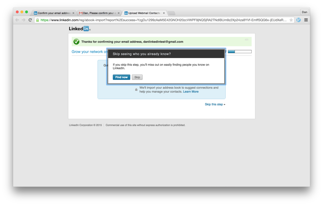
Just like before, if you click “skip this step” at the bottom of the page, a warning popup appears making sure you didn’t skip accidentally.

Get the App.
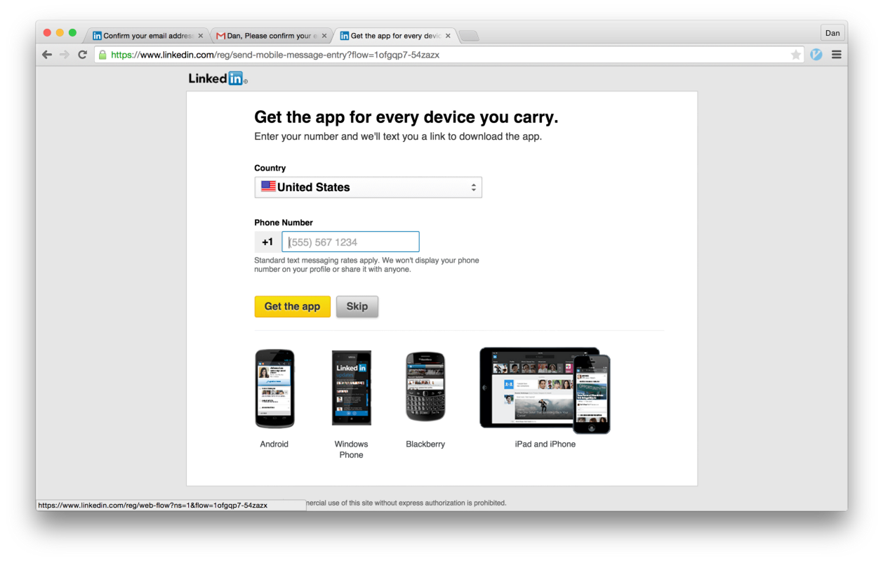
On the next screen, they offer to send you a link to download the LinkedIn mobile app. If they don’t get your address book on the web, maybe they’ll get it through your phone.
The Home Stretch.
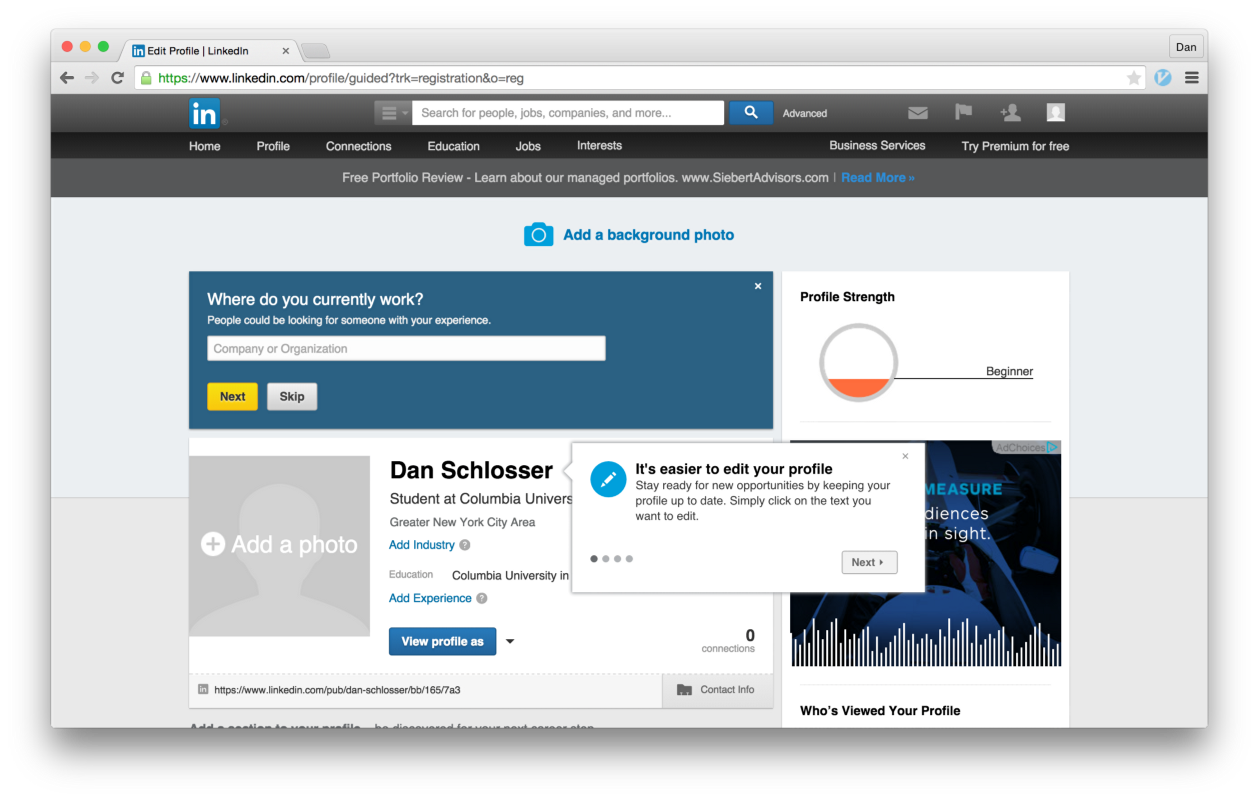
There we have it, finally signed up and signed in to LinkedIn. The next part of the new user experience is filling out your profile. Depending on how you count, LinkedIn tries to import the user’s address book three to eight times. It shouldn’t be this hard to sign up for a product without giving away any unnecessary information.
Worst Practices: The LinkedIn New User Experience
In software design, a new user experience, or NUX, is content that is driven to make the service valuable for new users who likely don’t have any connections or friendships on the service.
For my experience with LinkedIn, this started with a welcome email. Let’s take a look at how they use dark patterns to get you to sync your address book, even if you made it this far without doing so already.
The Welcome Email.
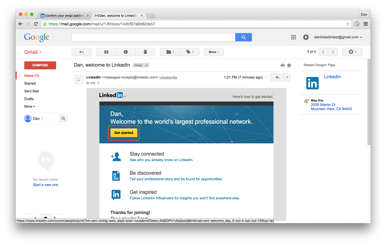
It turns out that the “Get Started” link and the “Stay Connected” link both go to two different screens that both do the same thing.
First, let’s follow the big yellow “Get Started” button, as I’m sure that’s what most people clicked.
Every Career Needs A Strong Network.
Big surprise. Yet another way to import our address book. In fairness, this is the page where the copy is most descriptive of what’s happening. The sub-header reads “Build yours by looking for your email contacts” and there isn’t any mention of “adding your email address,” which would have been very confusing.
Again, we see a big blue “Continue” button that just begs to be clicked.
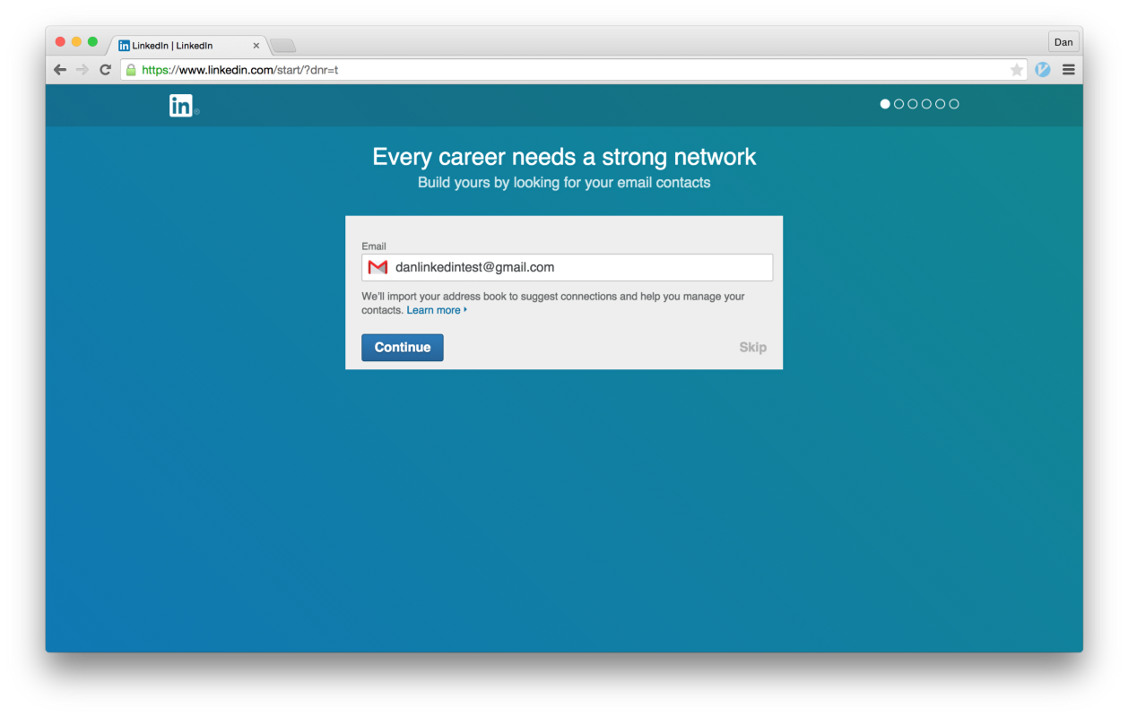 Also, LinkedIn is using traditional NUX designs to trick users into thinking that this is more of a tutorial than an attempt to get the user’s address book. Notice the dots up in the far right, and the solid blue background? This is different from every other screen we’ve seen before. It feels different than every other part of LinkedIn we’ve experienced so far.
For users of other web or mobile applications, this might feel like a first-time tutorial screen, where you click through the six screens that teach you what the app is, and then you get to actually use it at the end.
Most users are trained to click through these tutorial screens, and LinkedIn is counting on that. In case you hadn’t guessed it, the “Continue” button launches the Google OAuth popup again.
Wait…You Don’t Want A Strong Career?
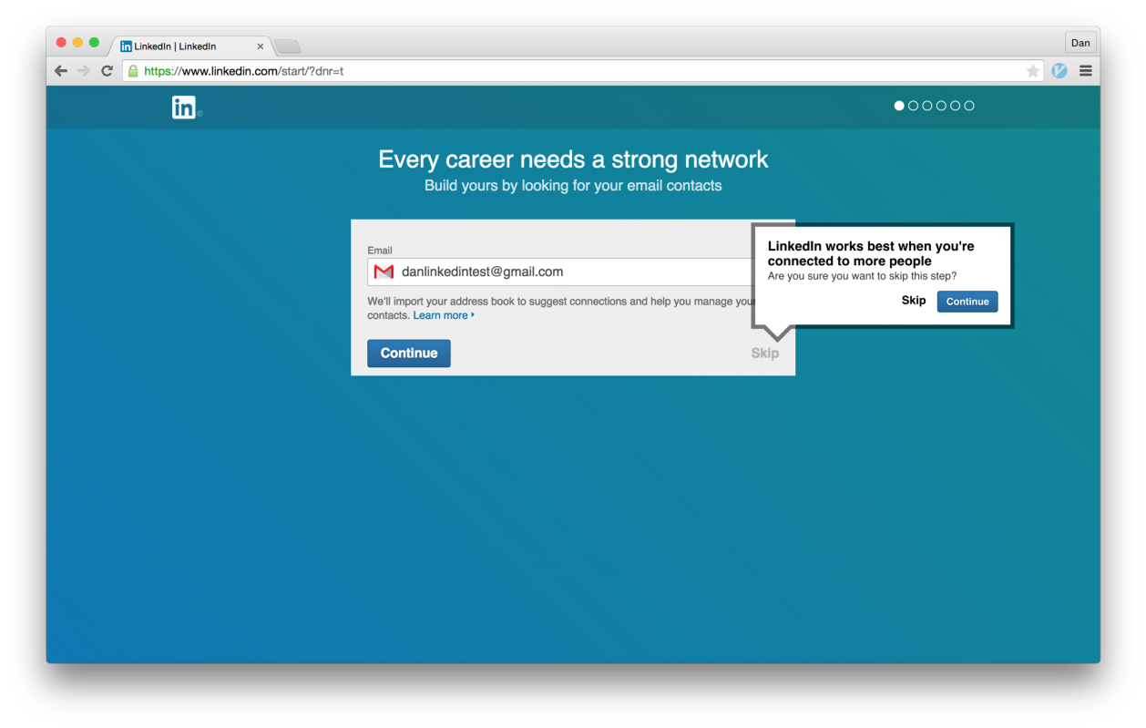
If you managed to find the skip link, LinkedIn asks you to confirm that you want to skip importing your address book. Once again, the blue “Continue” button in the popup is actually the “No never mind, I do want to give you all my contacts” button. We’re looking for the “Skip” link. This is a textbook dark pattern.
In the last screen, the skip link was hidden on the right, and the continue button was highlighted on the left, where it’s more noticeable. Here, that positioning is flipped, so if you happen to find the skip button, you have to reverse your thinking, and notice that this time the skip button is on the left.
To add insult to injury, the wording of the question is such that “Continue” seems like the answer we want. The word “Continue” has an affirmative connotation for most people, so when being asked “Are you sure you want to skip this step?” it seems unnatural that “Continue” doesn’t get us what we want.
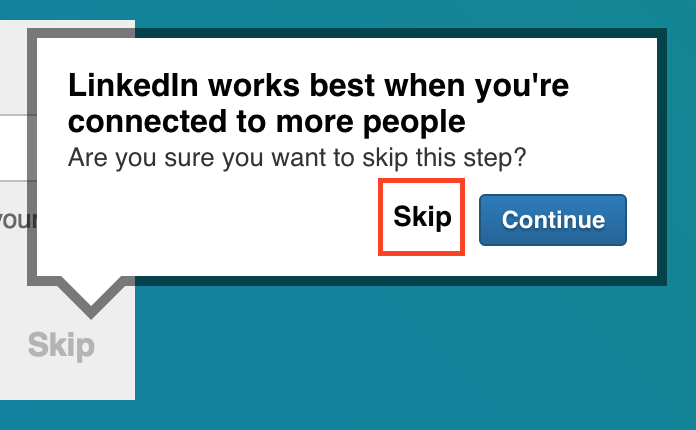
Let’s review everything this popup does.
- The big blue button is the “give us all your contacts” button.
- The skip link we’re looking for (and have already clicked once) has been moved to the other side of the button, which confuses the left-right association that was subconsciously built in the previous screen.
- The popup essentially asks “Are you sure?” and “Continue” here means “No,” which feels unnatrual.
Pretty clever.
The Rest of the LinkedIn NUX.
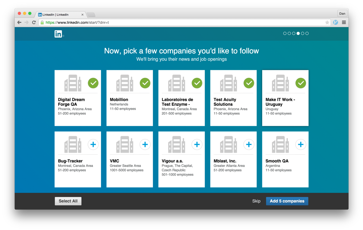
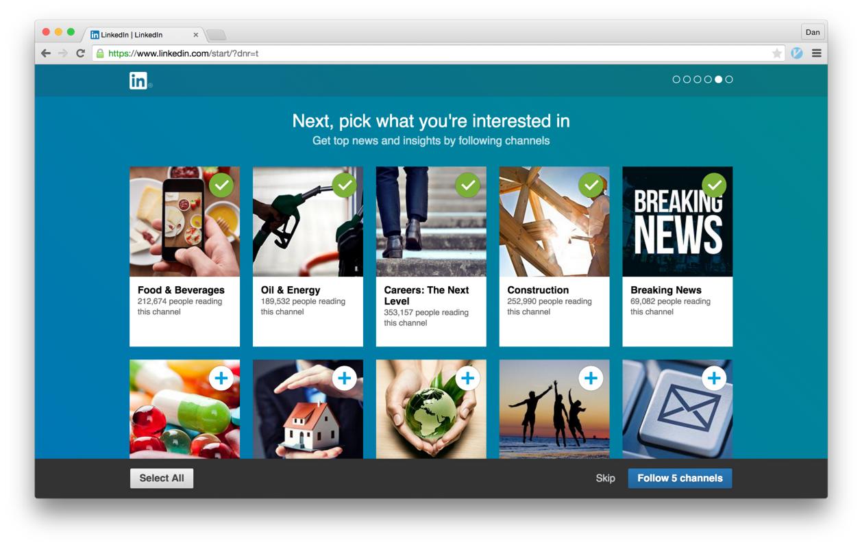
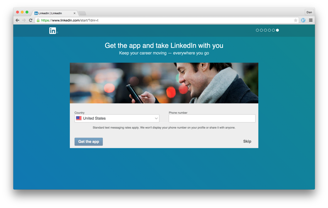
The rest of this flow is harmless. If you happen to make it through the previous screen without getting fooled, the rest of the new user experience screens serve to connect you with more companies or interests, or to get you to download the mobile app.
Done with the NUX? Wait, There’s More.
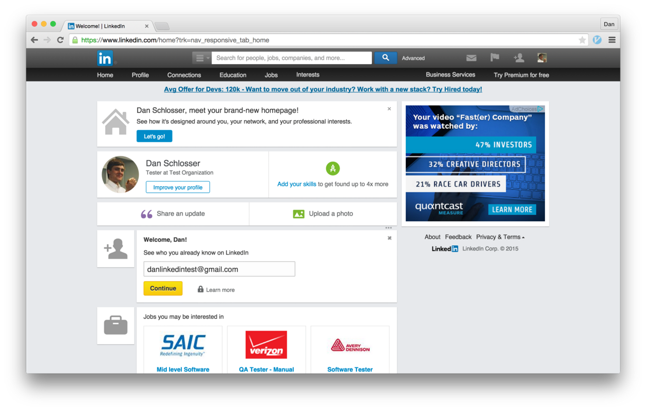
So we’ve finally finished, and we’re on the LinkedIn homepage. Now this page is a total mess design wise, but I’d like to draw attention to the “Welcome, Dan!” card that shows up, which has a big yellow “Continue” button.
By now, I’m sure you know where that goes…

The only solace I can find here is that the page is so cluttered that I doubt that most people would end up finding this link on the first time. Thankfully this card sticks around for a while…
What About That Other Link in the Welcome Email?
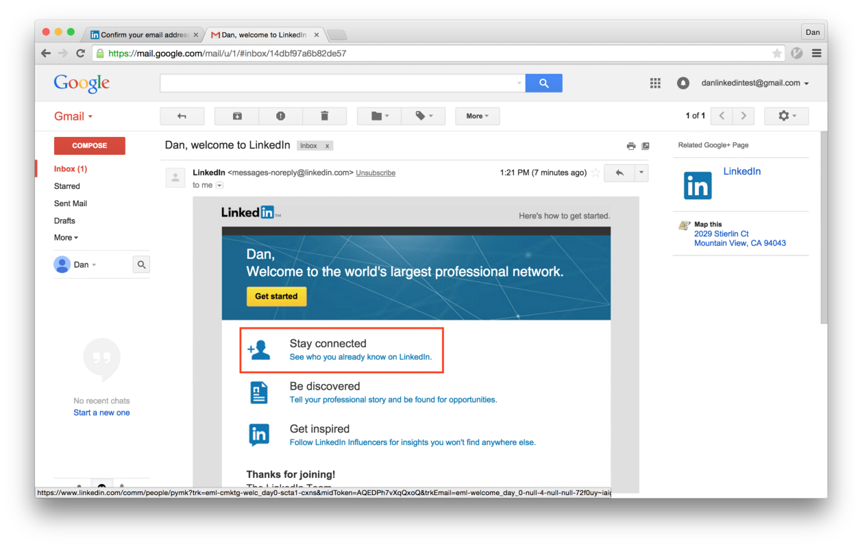
Remember the “Stay connected” link? Turns out that takes you to a completely different screen that also gets you to import your address book.
Yet Another Way to Add Your Email Address. Awesome.
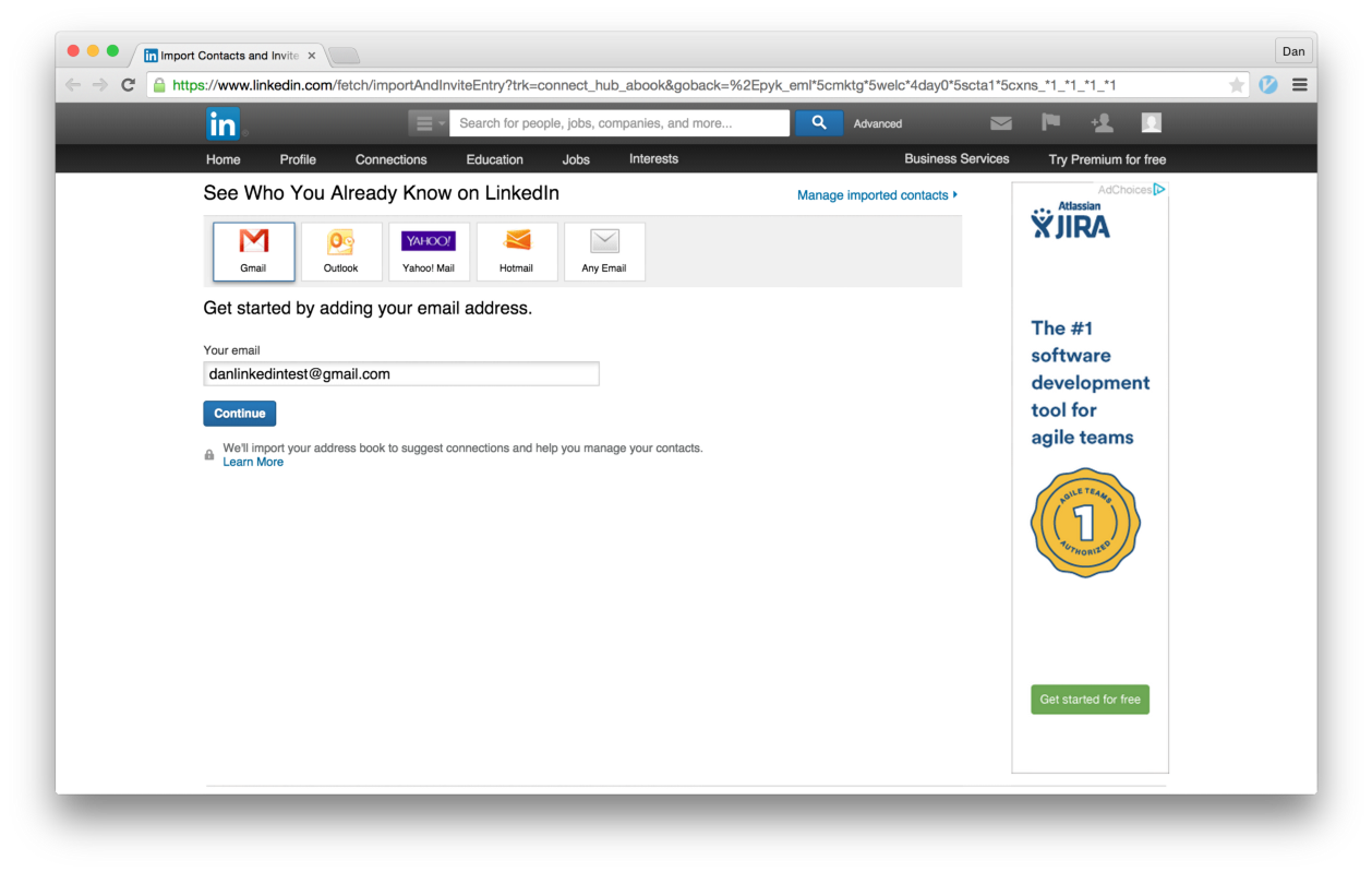
This page is no longer new user experience, rather it’s the permanent home for the “add your email address” flow. We see a return of the original copy which hides the true function of the “Continue” button.
LinkedIn Dark Patterns: A Final Word.
I hope you understand now that when you get spammy emails from friends inviting you to LinkedIn, it’s LinkedIn’s fault, not your friends’.
Many smart people have written about how dark patterns damage brands, and are harmful to user trust. I can unequivocally say that LinkedIn’s address book import design is harmful to their brand, even if it’s better for business in the short term. They make money when their network is more strongly connected, and so it is in their best interest that users connect their address books.
LinkedIn isn’t the only social network that uses dark patterns to grow their social graph, far from it. However, LinkedIn is an example of doing this to the extreme. It made me quit the service for two years, and has harmed my image of the company. Dark patterns are bad design, and bad design is bad business.
I guess I’m disappointed that LinkedIn doesn’t agree.
 PSA: If you’re wondering if LinkedIn has your address book imported, I wrote a short tutorial on how to find out, and how to remove it. Check it out here.
Dan Schlosser is a computer science major at Columbia University in New York and is currently participating in the Associate Project Management (APM) internship program at Google. Maybe you’ve heard of them.
Read more from Dan on Medium or check out his personal blog, Schlosser.io, for even more awesome. You can also follow Dan on Twitter @DanRSchlosser.
Recruit Smarter
Weekly news and industry insights delivered straight to your inbox.

